YEAR
2018
CLIENT
Private client
PROJECT
Caffette
SERVICE
Brand identity, Brand experience
CAFFETTE FOOD TRUCK
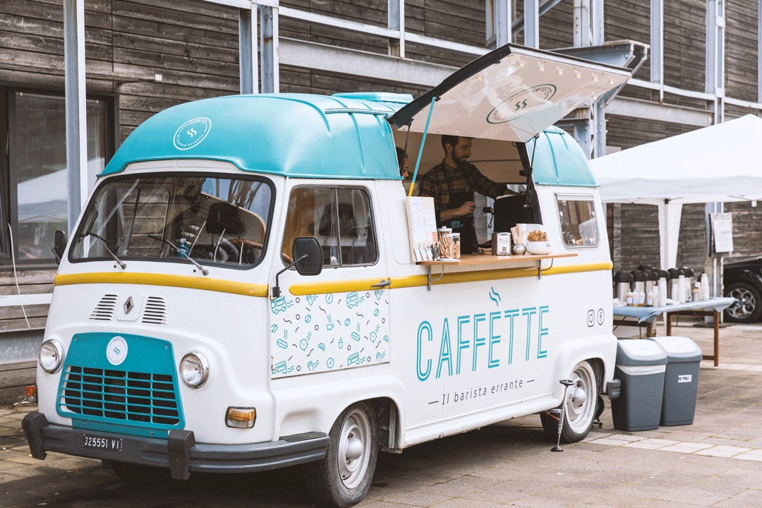
We were asked to create a full set of branding concepts and materials for the new outstanding food track Caffette. The naming is a tribute to the cozy vintage truck model Renault Estafette, which hosts the new retail activity. The claim “il barista errante” aims at recalling the international exposure of the business owner, who has previously travelled and worked in many European capitals. The same concept is also expressed by a distinctive lettering and a simple logo, which shape and style were inspired by the streets’ lines, the sense of movement and the coffee fragrance.
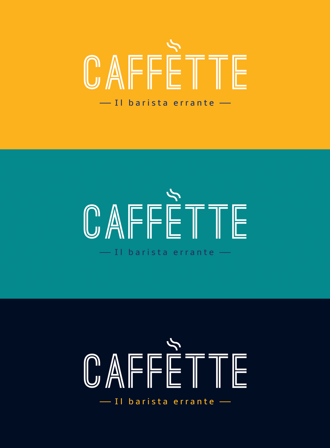
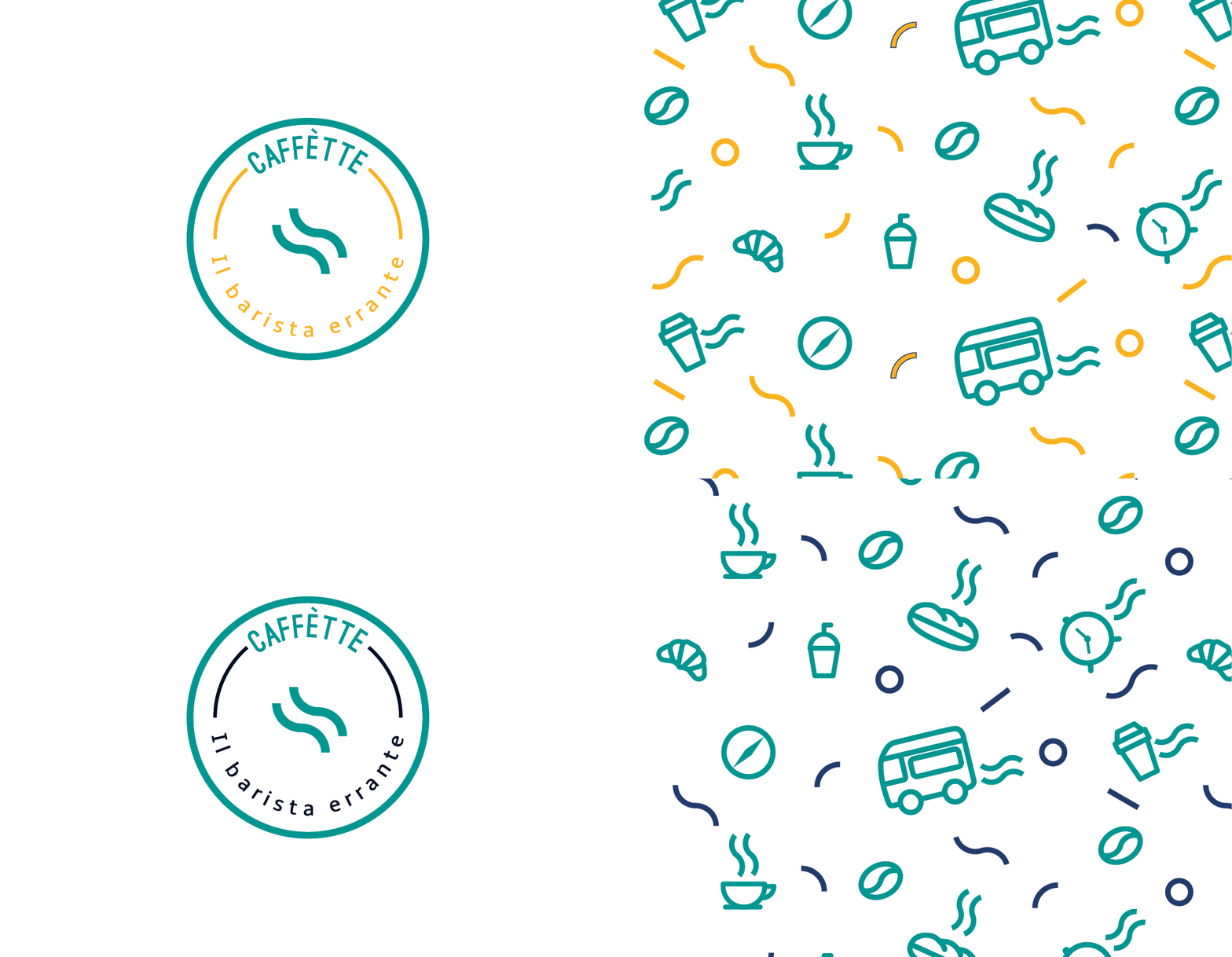
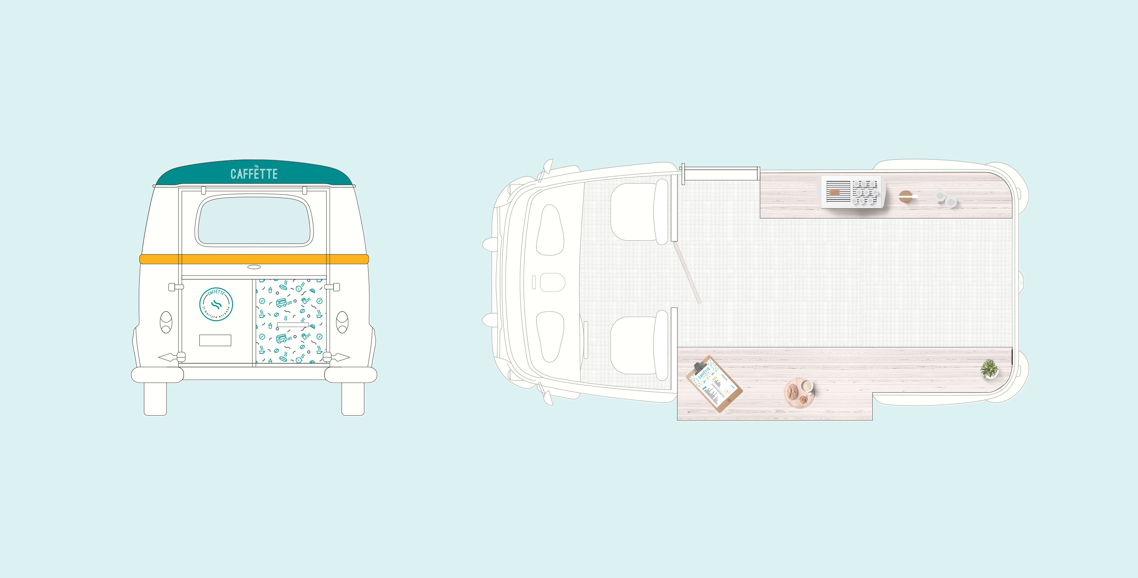
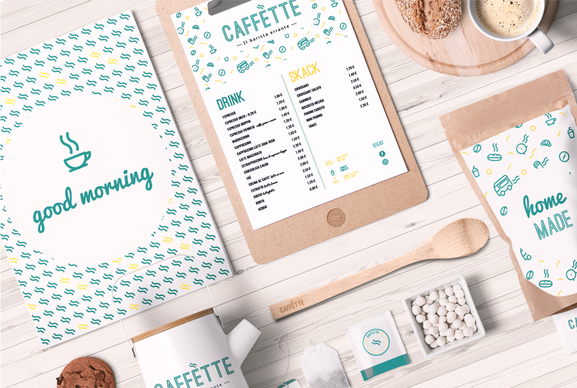
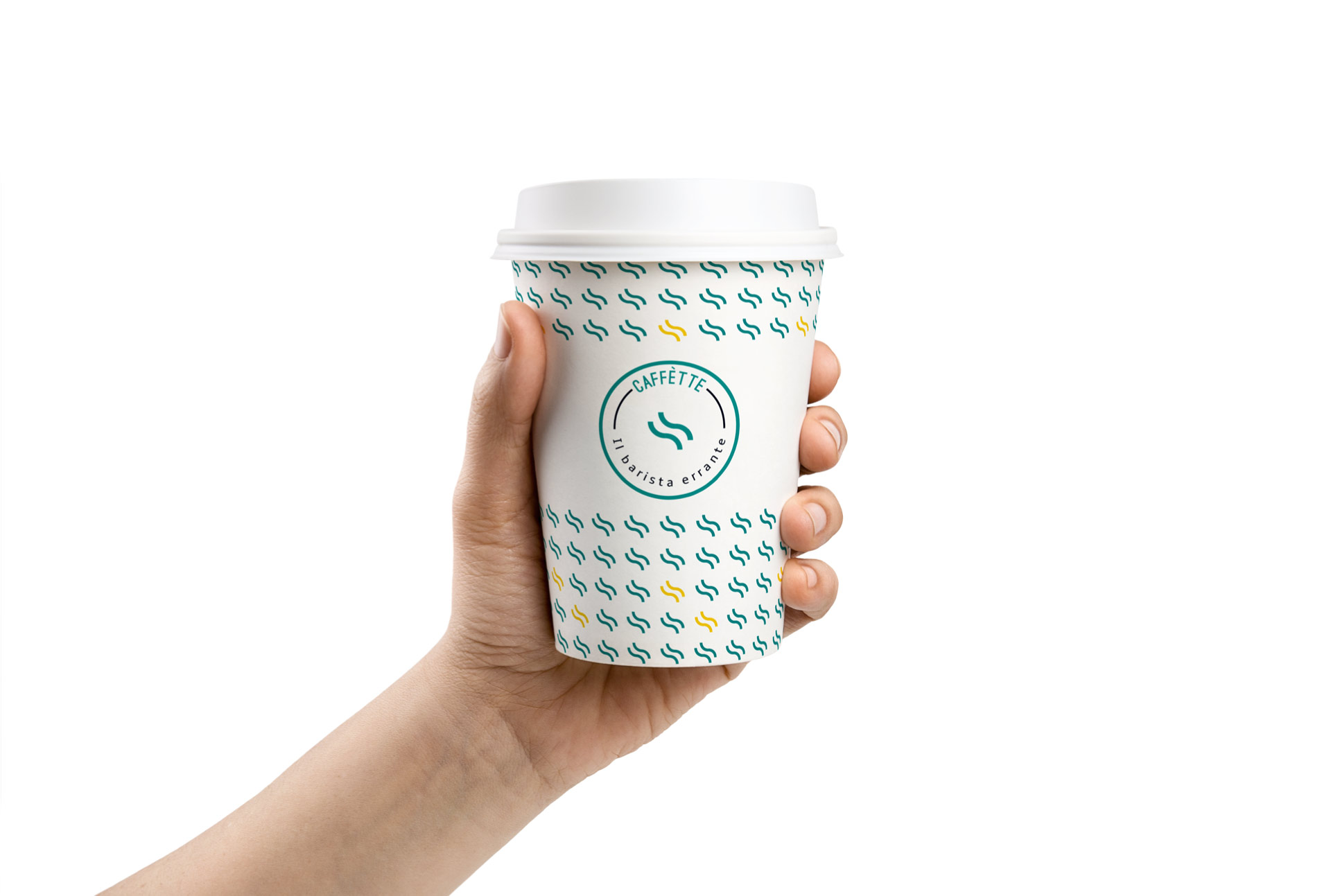
The challenge was to make an highly characterizing mark, while keeping an high level of visibility and clarity, so that the logo would be still recognizable when the food track is moving. The whole project features then an articulated, coherent and versatile brand identity made of: a logotype that can be used both horizontally, as well as inscribed within a circle; a set of textures and colours that can be applied outside and inside the food truck; a whole set of brand materials including cards, menus, aprons glasses and cups.
