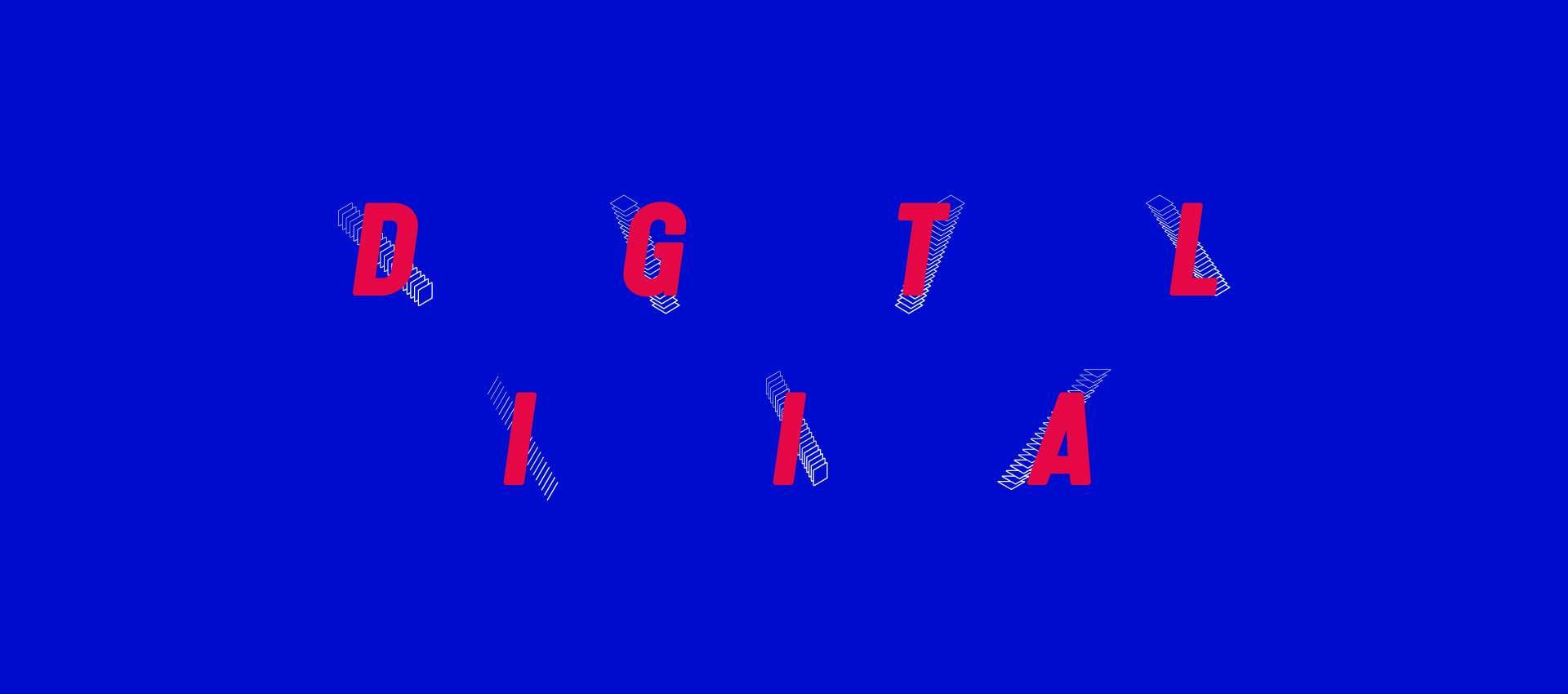
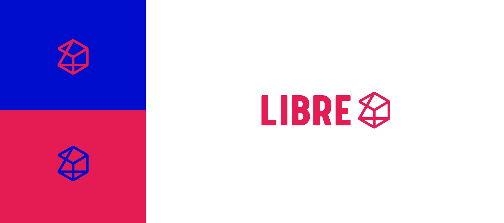
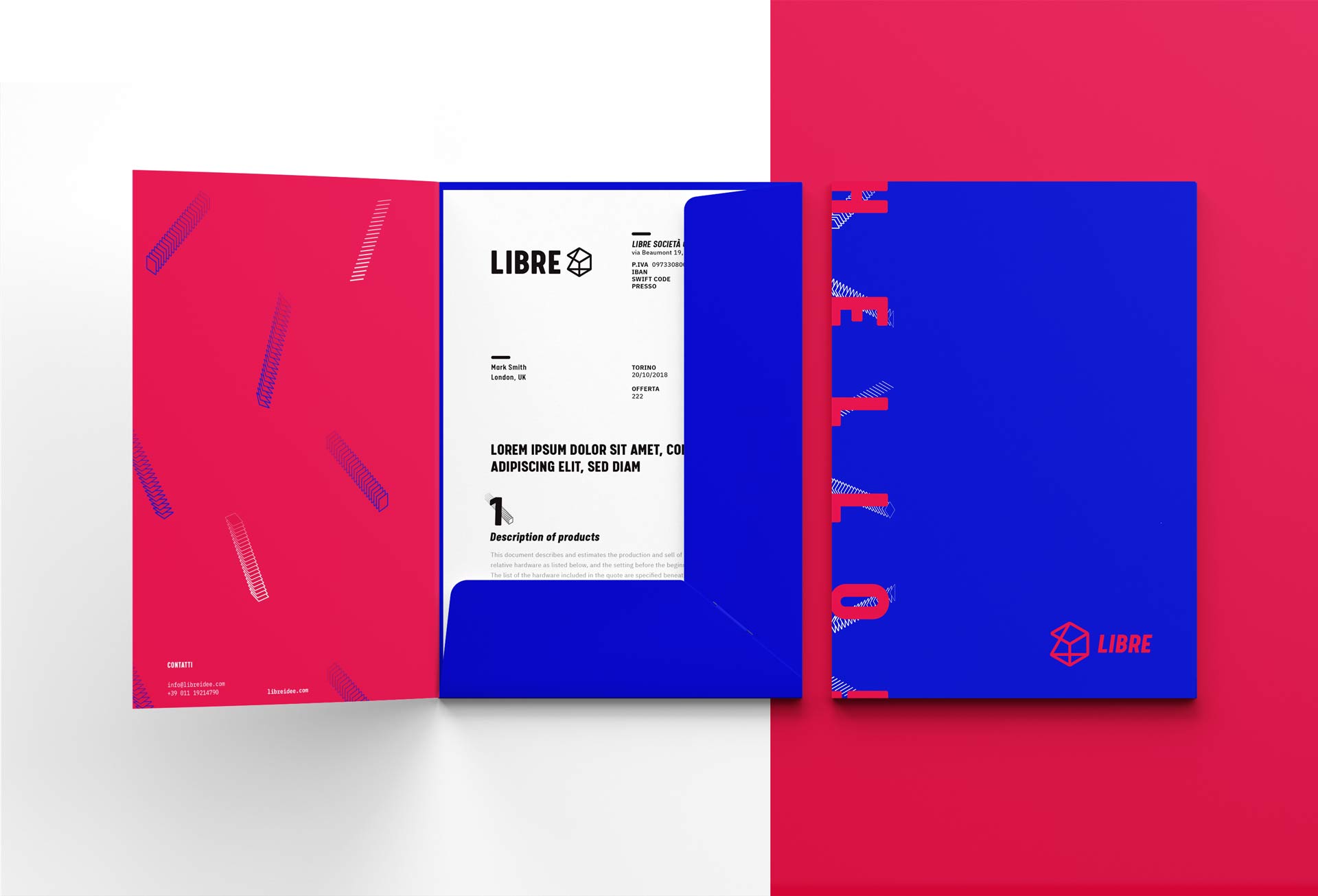
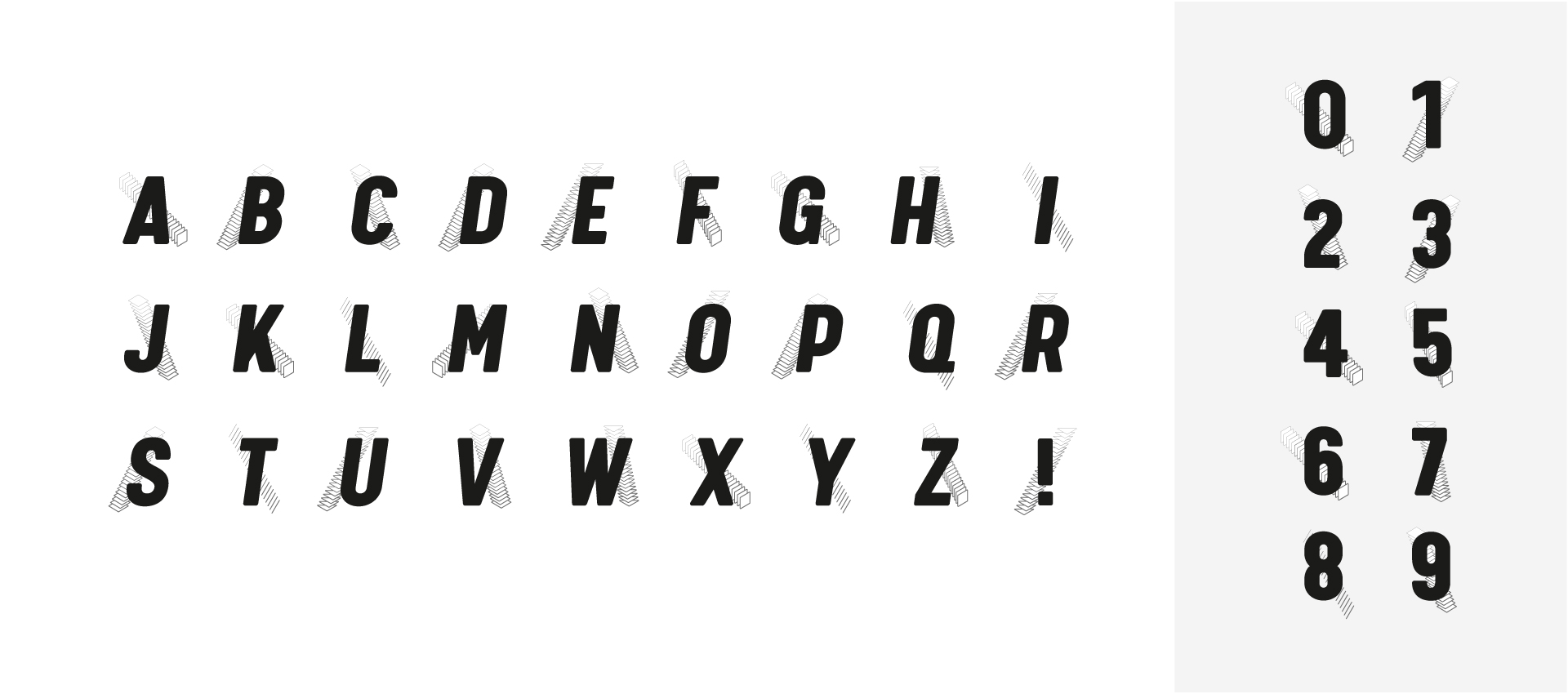
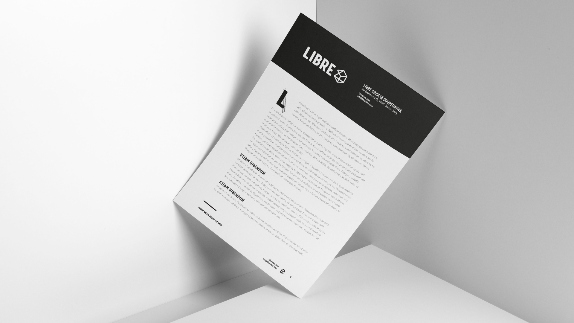
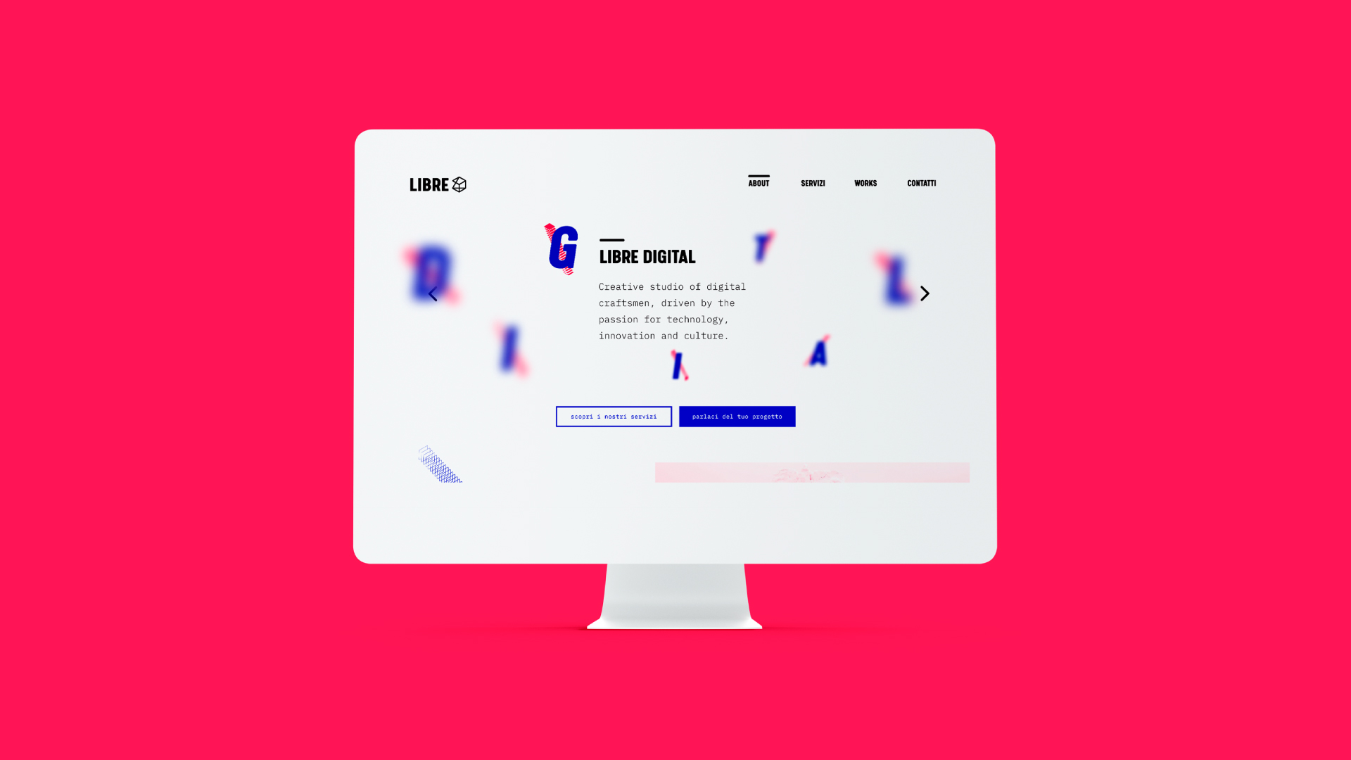
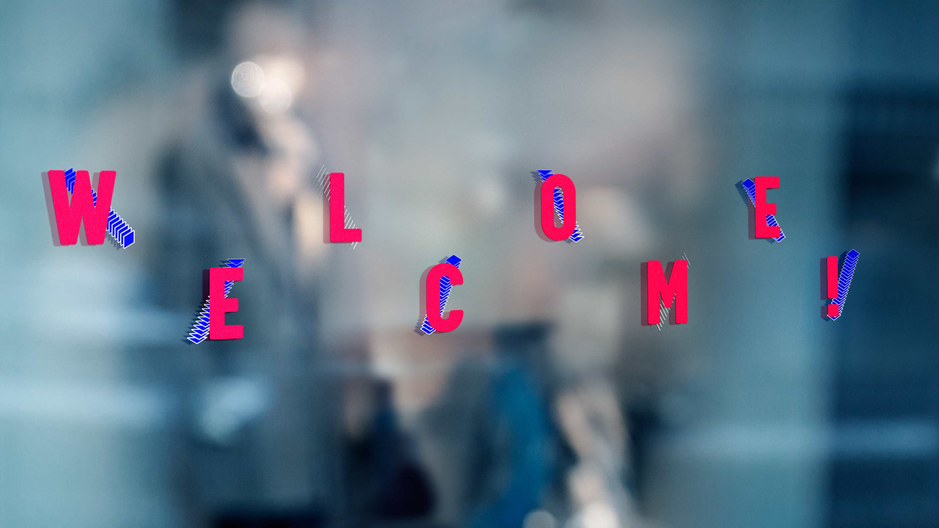
Libre has undergone radical transformation in recent years, so the identity needed to reflect this stance, and thus it was based on the idea of constant change. Inspired by the node maps, we explored the idea of a connecting data and information through design and graphic materials. We created a pattern that could be rearranged, added to and edited with different letters, in order to create a dynamic and distinctive evolving scheme. In this manner the identity could be easily adapted to the different fields of operation and subsequent branding message of Libre.

